We have relatively nice looking black formica countertops. I would love to have some sort of stone or marble, but there isn't a budget for that. I'd thought about updating the backsplash with tile, but since the counters have a built in backsplash, I wasn't sure how the whole look would go...and to be honest, even cheap tile is really pushing my budget.
Enter the wonderful world of stencils. I've now done 2 accent walls in my house with stencils (soon to be revealed) and I just enjoy the simple transformation.
I first tried to make my own chevron stencil, but that was an utter failure. So I ordered a very affordable one from Ebay, which put this project at about $16 since I already had the paint.
My walls are already painted in SW Zircon. I used Duron's Aria Ivory (colormatched by Valspar) for the stripes.
My walls are already painted in SW Zircon. I used Duron's Aria Ivory (colormatched by Valspar) for the stripes.
Miraculous!
Before:
This process was really painful as far as my energy, time and stress level. To be honest I had moments where I felt rage-lol. Gah, those corners...and the window!! I started it at 7pm (thinking it wouldn't take long) and finished around 1am, but it was so worth it (even with the rage).
Obviously, my work area lacks order and beauty, but it got the job done
The only thing I don't love are the imperfections that naturally come with stencils, but overall, it's amazing.
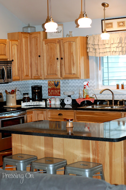
I love everything about how the kitchen looks now. The chevron pattern is enough of a repeat that it almost appears to be like tile.
I love how my new coffee bar looks here as well as
The other side of the kitchen
The wire basket holds our fabric napkins.
The tiered shelf holds fruits and veggies - I'm still trying to decide if I should paint it white...thoughts?
I repainted the front of this little frame in plumage blue
(I left the inside the original color for interest).
(I left the inside the original color for interest).
A gift to me from my sister, it has my motto stitched on it as a beautiful reminder of perseverance.
I hope you've enjoyed the little walk through my kitchen. It's so much more exciting and bright now and will be a much needed pick me up during the long dark winter months.

Featured At:!!!!!!



Linking to:
Winter Blues Wednesday @ DIY by Design
Wow Us Wednesdays @ Savvy Southern Style
Wow Us Wednesdays @ Savvy Southern Style
Homemade by you @ Pincushion Creations














Fantastic job Miranda!!! I really love this!
ReplyDeleteAnd I so get the rage part lol
Hugs,
Suzan
It looks amazing, you did a great job :)
ReplyDeleteIt looks wonderful Miranda! I can't wait to have my own kitchen back.
ReplyDeleteIt does look like tile... you fooled me at first. Great job.
ReplyDeleteI took some time to check out your blog since this was my first visit. I find it interesting that you are from WA state and want to move back. I am in WA state and desperately want to move back to the South or to Texas (our only child lives there). We, too, are trusting God and waiting on His perfect time.
ReplyDeleteYou have a great blog.
I love your kitchen and the chevron backsplash! What an inventive way to use this awesome pattern! Great job! I am now following you. :)
ReplyDeleteGreat idea painting the backsplash with the chevron pattern. I am going to send it on to our son for his loft backsplash. If you decide to paint the fruit stand - maybe you should consider painting it red. That should brighten up your winter!
ReplyDeleteyour kitchen looks like a great space, and what a great idea for that backsplash! i love me some chevron.
ReplyDeleteWow, I can so relate to the idea that a project will take no time at all only to discover it takes FOREVER!!! Love your result. I am probably the only blogger out here that doesn't like chevron, but this looks so fabulous I may change my mind!
ReplyDeleteGreat job!! found you through hometalk
This is gorgeous! I would love for you to share it on my weekly linky party Blog Stalking Thursday. http://www.thecraftyblogstalker.com/2012/08/blog-stalking-thursday-54.html
ReplyDeleteI love it!! Thanks for the inspiration- I've been trying to figure out what to do with my back splash area besides tile. Here from 36th Ave
ReplyDeleteWorking till 1 am ... you go girl! The chevrons look great and they bring a lightness and energy to the space, really helps move the eye through the entire kitchen. I'm a chevron lover but I can't imagine a better pattern in your kitchen. Great job.
ReplyDeleteRobin @ happilyhomeafter.blogspot.com
Love it Mir! Looks so crisp!
ReplyDeleteMiranda!!!! It looks so fabulous! Very impressive results. I personally like the basket as is. I love your kitchen. Thanks so much for linking up at I Gotta Create! <3 Christina
ReplyDeleteIt looks great! I know how frustrating the stenciling can be!
ReplyDeleteI adore this. What a transformation !!! Very inspiring as I look at my plain white backsplash.
ReplyDeleteSuper cute, Miranda!! Sharing this on my FB page. Thanks so much for linking up! :)
ReplyDeleteThat looks great! Thanks for stopping by my blog!
ReplyDeleteSuch an awesome project. Seriously changes the whole look of the kitchen. I am stopping by from some link party, but not sure which one. In any case, just showing some comment love.
ReplyDeleteI did enjoy the walk through your kitchen and love how the chevron stenciling does give it a tiled looked. I think your the first for a chevron back splash! I would leave the shelve you use for veggie as is, it pops against the lighter chevron - white would just blend in and you veggies would look like sitting in air. I also like the texture it brings to the room. You sure have transformed your kitchen. Thanks for sharing your creative inspiration with Sunday’s Best – you helped make the party a success!
ReplyDeleteIt's amazing how much a little pattern changes the feel of the room. I love the chevron!
ReplyDeleteIf you get a chance I would love for you to link up your tutorial at my Pin Party.
http://sarahdawndesigns.blogspot.com/2012/08/pintastic-monday-link-party-5.html
Wow, I love this and totally thought it was tile when I first saw the picture. I stenciled a wall in our master bedroom, so I totally understand the rage!
ReplyDeleteKathleen @ Projects at the Pickett's
So beautiful! I've been considering doing something like this as well because a backsplash is just way too much of an expense right now. New follower!!
ReplyDeleteThat turned out fab Miranda! Thanx for linking up!
ReplyDeleteWow, love this!
ReplyDeleteYou did a fantastic job! I'm feeling inspired to copy you. I also love that you spell your son, Adin's, name "correctly" (the way I spell my Adin's name:)
ReplyDeleteWow! You really did an amazing job! I love the color too! It's just the perfect accent without being overwhelming. :D Wonderful!
ReplyDeleteWow, it all looks wonderful! So jealous! Thank you for sharing at our
ReplyDeletePinteresting Party!
I'd say the rage was worth it!! It looks so pretty and I love the colors. Thank you for sharing it at my Throwback Thursday party! :)
ReplyDeleteThis is amazing...featuring you on Saturday! XO, Aimee
ReplyDeleteMiranda, the chevron looks awesome on your back splash! Thanks so much for sharing at our Pinteresting Link Party!
ReplyDeleteI'm in love with this backsplash! Thanks so much for linking up to Fabulous Friday. I am featuring you tomorrow!
ReplyDeleteI think it looks great!!! You could try to paint one basket and see how it looks :)
ReplyDeleteThanks so much for sharing this at The DIY Dreamer... From Dream To Reality!
Wow! Love! It almost makes me wish I didn't spend the money on tile...our backsplash could've looked incredible for a whole lot less!
ReplyDeleteThis is gorgeous! I love it so much! I also like all your accessories. Great job. Thanks for sharing at Terrific Tuesdays.
ReplyDeleteRachel
adventuresofadiymom.blogspot.com
Its so pretty! Ive always wanted to put chevron in our kitchen... and I have a rooster decor all over. This just convinced me it can be done! LOVE YOUR KITCHEN!
ReplyDeletexoxo
Heather
www.heatherlyloves.com
Love this idea! It really makes the kitchen bright and happy!
ReplyDeleteWow, Miranda! That looks beautiful! And it does look like tile from a distance! Love it! I'm including a link back in today's highlights. Thanks for sharing your creativity!
ReplyDelete